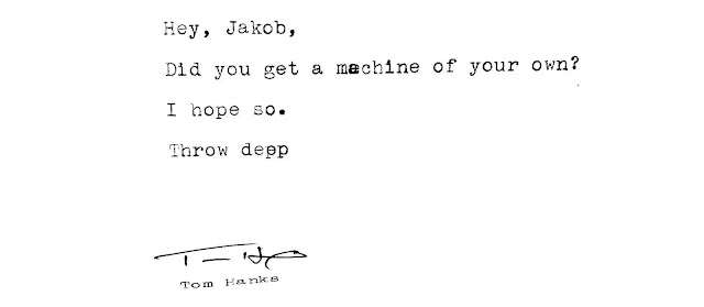
How wonderful is this?
See more on
The Typewriter Database, where Julian Walkner writes:
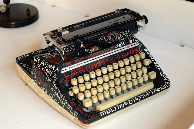
This Triumph Gabriele 35 has an OCR typeface. OpticalCharacterRecognition. The typeface OCR-B was developed in 1968 by Adrian Frutiger. The look is less technical than the OCR-A font, which was one of the first fonts to meet the U.S. Bureau of Standards criteria. ... The goal was to design a typefont that could be automatically read by machines, and that would be aesthetically accepted by the human eye.
The description is from the time the font was published and not some information that was gathered for an article 30 years later - it closes with the sentence: „We can hope that one day "reading machines" will have reached perfection and will be able to distinguish without any error the symbols of our alphabets, in whatever style they may be written“.
Julian continues:
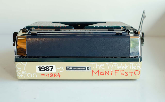
For those who wonder why the typewriter looks like this. Here's the story: When the machine arrived at my house, the plastic chassis was broken into 3 pieces. I was very happy that I had recognized the font correctly based on a few recognizable typeslugs on the photo. But what to do with the chassis? Ok, I glued it together, but now cracks are catching my eye.
I decided to „tattoo“ the machine with words. But I'm not a writer.
This particular typeface, on a mechanical machine, is a link between analog and digital.
This font was developed to make it easier for computers to understand human „language“ .
Now, 50 years later they do „understand“ us in various ways but we don’t want them to understand everything and all the time. Under this perspective, the words of
The Typewriter Manifesto seemed the perfect fit to me.
Thank you, Julian. And the idea of writing the Typewriter Manifesto on a typewriter has actually never occurred to me before.